Barber
2025–2026
Designing a barber discovery and booking experience
A mobile app concept explored in 2025 and revisited in 2026, refining how customers discover a barber, choose an appointment, review payment and receive confirmation.

The problem
Booking required too much back-and-forth
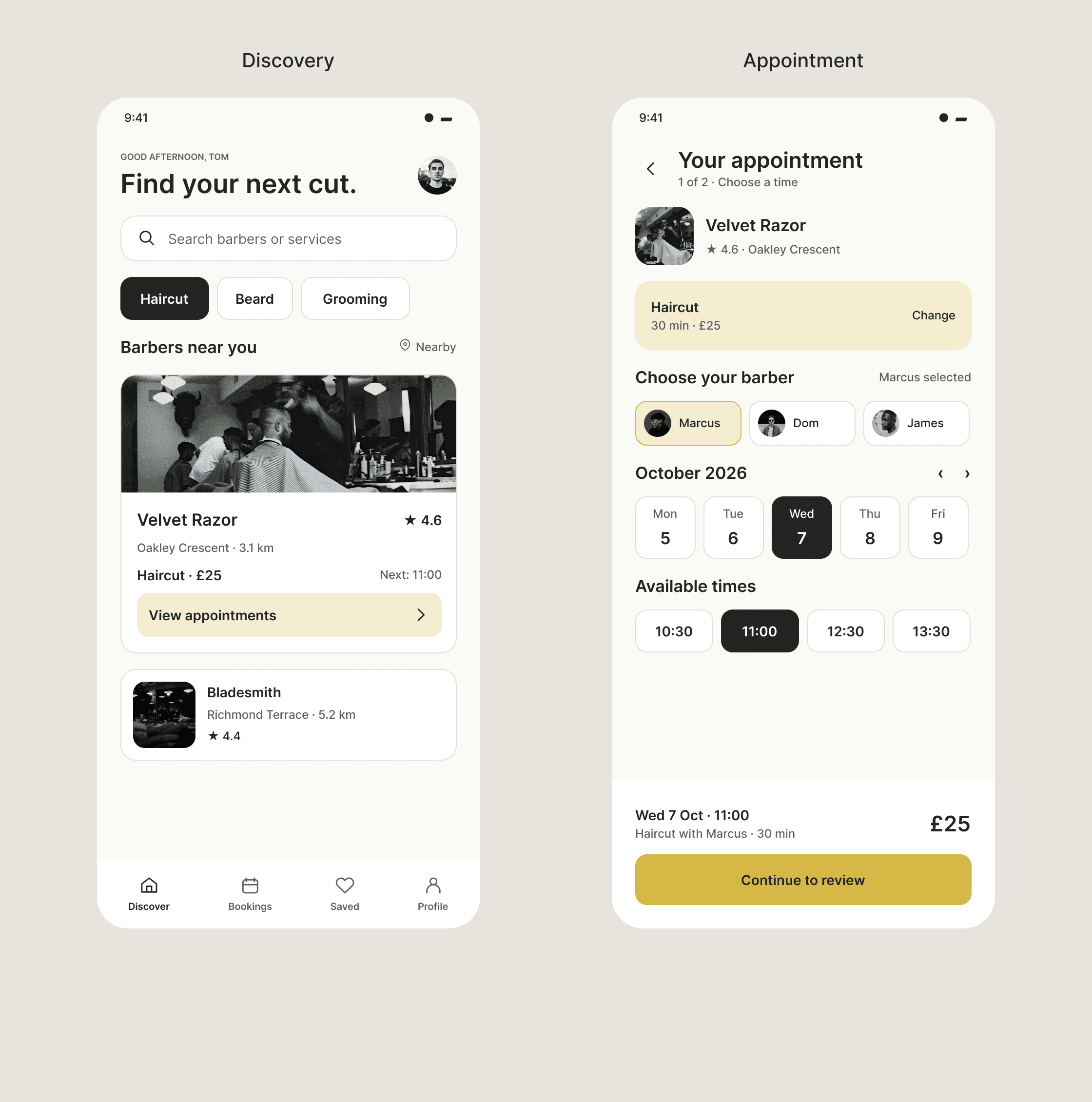
The 2026 discovery and appointment screens show service search, shop context, barber selection and the chosen appointment. Both screens belong to the refined customer journey.
Checking availability through messages or phone calls can leave customers waiting for a reply before they know whether an appointment is possible. Comparing shops, understanding prices and communicating preferences can add further uncertainty.
Barbers face a related challenge: managing appointments around their working hours, handling changes and protecting their time when customers do not attend. I explored these needs together before developing the customer-facing concept.
Customers needed:
Clear availability and service information.
Confidence when choosing a shop or barber.
Easier booking and communication.
Barbers needed:
Better control over appointments.
Protection against missed bookings.
Clearer information about customer preferences.
Research
Understanding customers and barbers
I conducted four informal interviews with customers aged 19–34 and two interviews with barbers—one freelancer and one shop-based. I also reviewed three booking platforms and used an Instagram poll to explore frustrations around booking.
Three themes shaped the direction:
Availability without chasing replies
Customers described uncertainty when checking availability through messages. This pointed towards making appointment selection explicit within the booking journey.
Context for choosing a barber
Customers wanted help choosing a barber and understanding the service. Shop imagery, location, ratings and individual barber profiles became useful information to surface during discovery.
Control beyond the customer journey
Barbers raised missed appointments, schedule control and communication needs. These highlighted the importance of operational tools alongside the customer experience, even where those tools remained outside the developed concept.
Customer interview: “I hate having to DM my barber just to check their availability — I never know when they’ll reply.”
Barber interview: “My current app doesn’t let me block out last-minute days off — I have to manually text everyone.”
Scope
Focusing on the customer booking journey
The research surfaced needs on both sides of the appointment. The concept I developed focused on the customer journey: discovering a shop, choosing a barber, selecting an appointment and reviewing payment before receiving confirmation.
Barber scheduling controls, reminders, cancellation policies and richer preference sharing remained opportunities beyond the screens developed here.
Developed in this concept:
Shop discovery and search.
Shop and barber selection.
Date and time selection.
Payment review and booking confirmation.
Further opportunities:
Barber calendar management.
Reminders and cancellation rules.
Deposit policies.
Style notes and reference photos.
The core journey: Discover → choose a shop and barber → select date and time → review payment → receive confirmation.
Design decisions
Helping customers choose and commit
Give discovery useful context
The 2026 discovery refinement puts service search and categories alongside shop cards with location, distance, rating, price and next availability. The 2025 home screen showed services, an offer and nearby shops as separate areas.

Original · 2025: service imagery, an offer and nearby shops appear across the home screen. Refined · 2026: search, service filters and shop cards show rating, location, price and next availability together.
Make appointment choices visible
The refined appointment screen brings barber choice, dates and available times into one view. Clear selected states and an appointment summary remain visible before the customer continues to review.

Original · 2025: barber, date and time are chosen on the booking screen. Refined · 2026: the selected barber, date and time stay visible with an appointment summary before review.
Separate payment review from completion
The refined Review & Pay screen shows the selected appointment, total and payment method before the payment action. Booking confirmation is a separate completed state that repeats the appointment details.

Original · 2025: a payment sheet combines place, date, card and confirmation action. Refined · 2026: a dedicated Review & Pay screen shows the appointment, total and payment method before booking.
Development
Revisiting the 2025 concept in 2026
I used wireframes to establish the main screens and booking sequence before developing the visual interface. Informal feedback recorded in my project notes described the layout as approachable and shop imagery as useful. The notes also highlighted the reassurance provided by booking confirmation.
In 2026, I revisited the 2025 concept and refined the customer-facing flow. Discovery gives more direct shop context; appointment selection makes the chosen barber, date and time clearer; payment review brings the details together before the action; and a separate confirmation screen makes the completed booking state explicit.
The comparisons above show the original 2025 screens beside the 2026 refinement. The final flow below shows review and payment followed by booking confirmation.
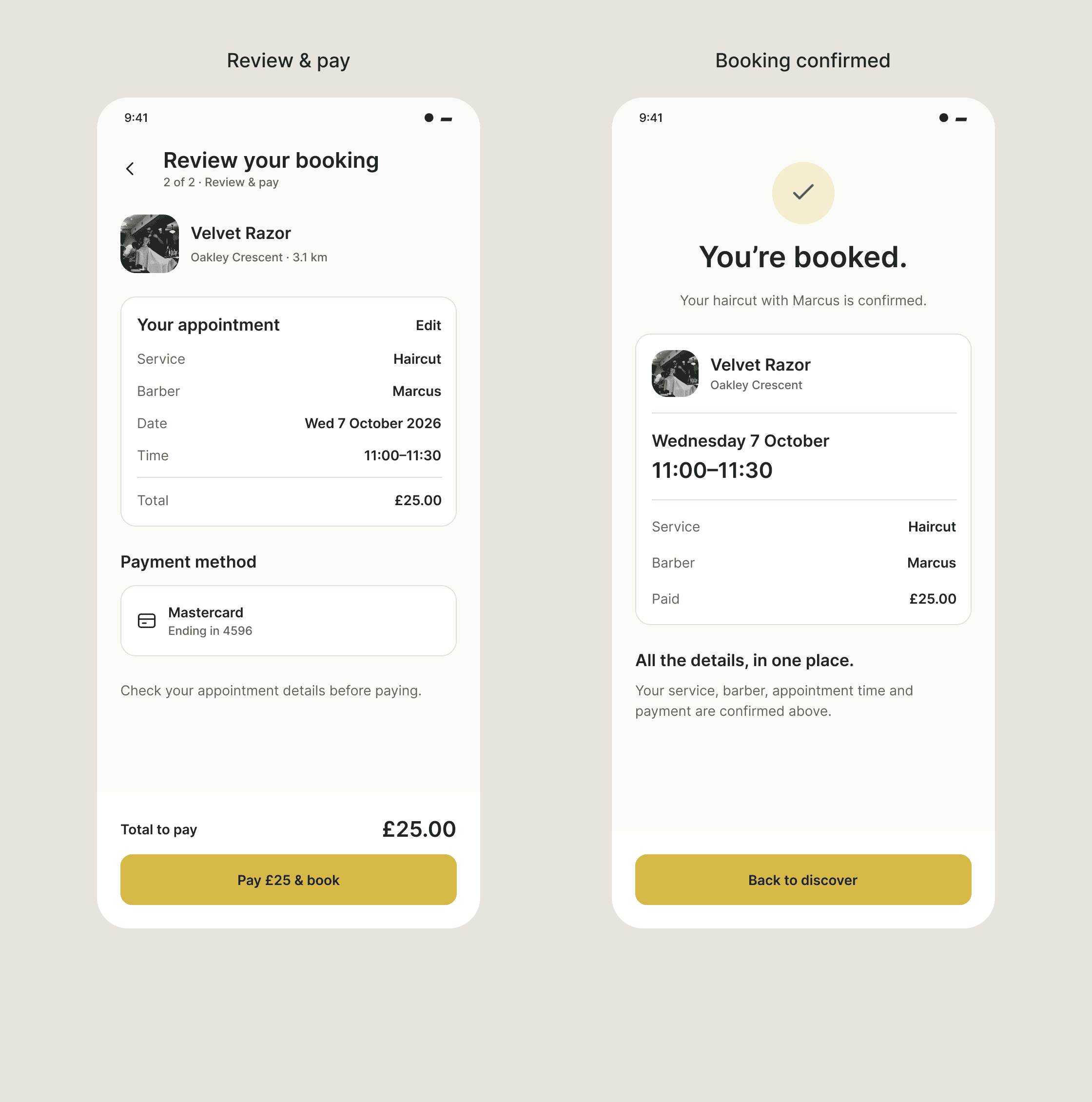
The refined Review & Pay screen is followed by a separate booking confirmation state that repeats the service, barber, appointment time and payment.
Outcome
A developed concept, with clear next questions
In 2025, over three months, I developed a customer-facing barber discovery and booking concept, taking the work from exploratory interviews through user flows, wireframes and detailed UI.
Research helped me understand how customer uncertainty connects with barbers’ scheduling and communication needs. The screens address the customer journey; the barber-side tools remain outside the developed scope.
Informal feedback on the 2025 concept was encouraging, but I did not complete a structured usability evaluation of the final 2025 interface or the 2026 refinement. The concept was not launched.
What I would test next:
Can customers select a shop, barber and appointment without assistance?
Do they understand the amount, payment action and booking status?
How should availability, cancellations and missed appointments work for barbers?